Overview
Redesign an existing B2B platform for a better user experience and increase sales
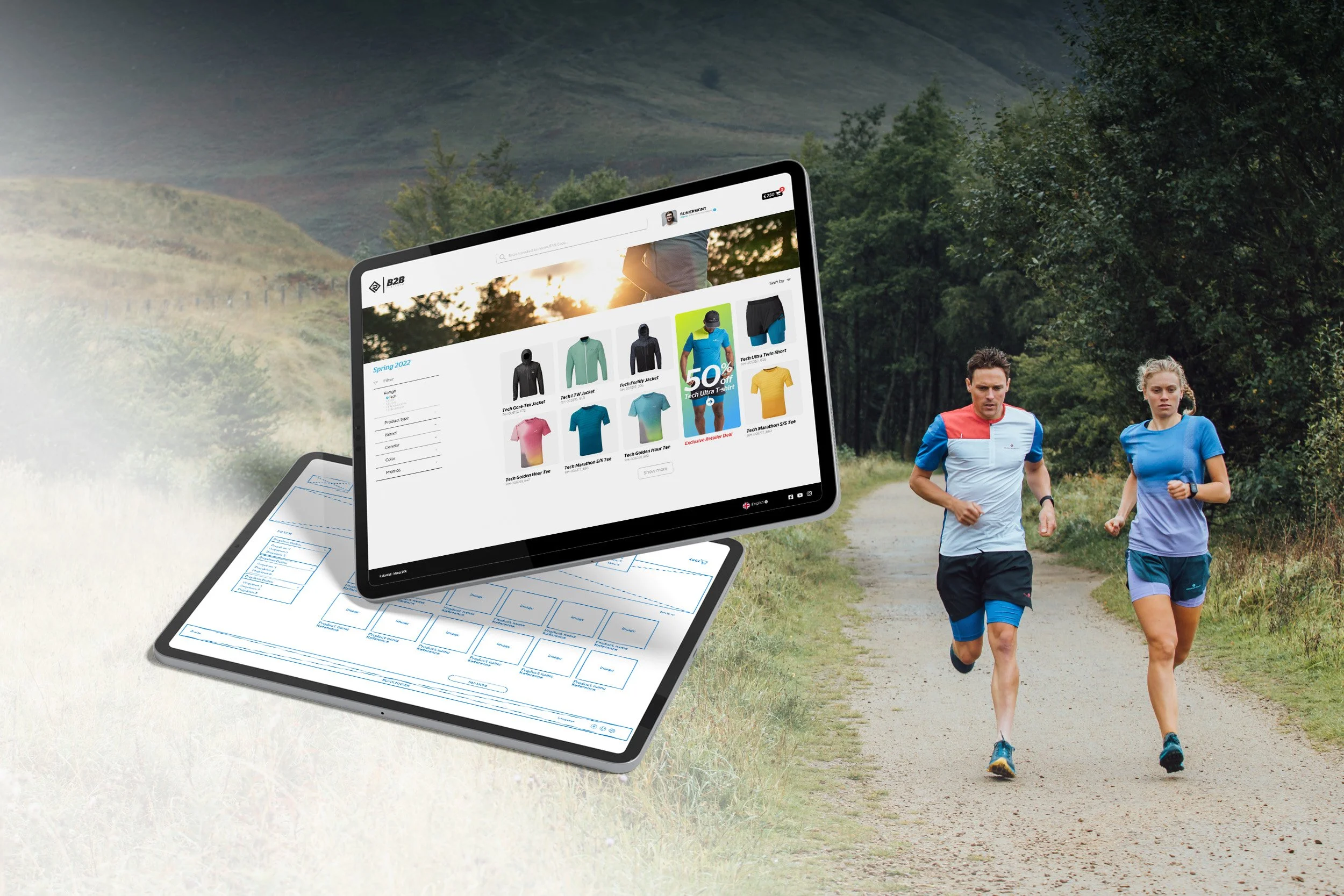
The British running brand Ronhill® invested a couple years ago in a brand new B2B platform that would allow all of their professional customers, retailers, stores to directly reorder throughout the season.
This platform, Visual SFA, would display all SKU’s from the current season range, so the customer could easily order what he would need, without the need to order on the phone or by e-mail to its usual sales rep.
While freeing up the sales reps of the company some valuable time, the main goal was also to increase the turnover.
Unfortunately, 2 years later, no major increase in turnover has been identified, sales reps still take orders from their stores on the phone/mail and the B2B platform mainly received bad feedback. Needless to say that the ROI has been terrible.
The company’s ideal B2B needs to be easier to use, fast, as well as been better at promoting/pushing deals more efficiently.
My client required my expertise to identify what was going on with the current platform, understand their user needs, so we could address all these issues that would ultimately lead to an increase in turnover.
Objectives
The main objective was to identify the issues of the current version and bring to the table a solution by redesigning a more user friendly platform.
By doing so, the customer would visit and use the site more frequently, leading to ordering more.
This would ultimately also meet the company financial goals, which were turnover increase and ROI.
By creating this outcome for the user (better user experience, more orders), I was able to deliver this outcome for the business (turnover increase from the platform).
My role
I conducted an assessment of the current B2B platform.
I created user researches with interviews, usability testings, surveys and feedback to understand the various pain points of the current user experience and identified who was the user.
With all the findings above I redesigned the whole B2B platform to address all the outstanding issues.
I also suggested a mailing campaign to inform all users that a B2B platform was up and running with a new design, a better experience.
As a product designer, I worked with the platform developers at Visual SFA, the product manager, sales director and platform manager at Ronhill®.
Duration
6 months
Users
Retailers
Chain stores
Sales reps
Tools
Adobe XD, Illustrator, Photoshop, FlowMapp, Transmit, Zoom, Skype, MailChimp. (oh and a pen, a sketchbook & an eraser! ;-) )
Design Process
1 • Discover
Assessment of the current platform
User research, both qualitative and quantitative
Competition analysis
4 • Design
Sketches - Low Fidelity wireframes
High Fidelity wireframes on XD
Style guide
2 • Define
Key insights
Brainstorming - Persona
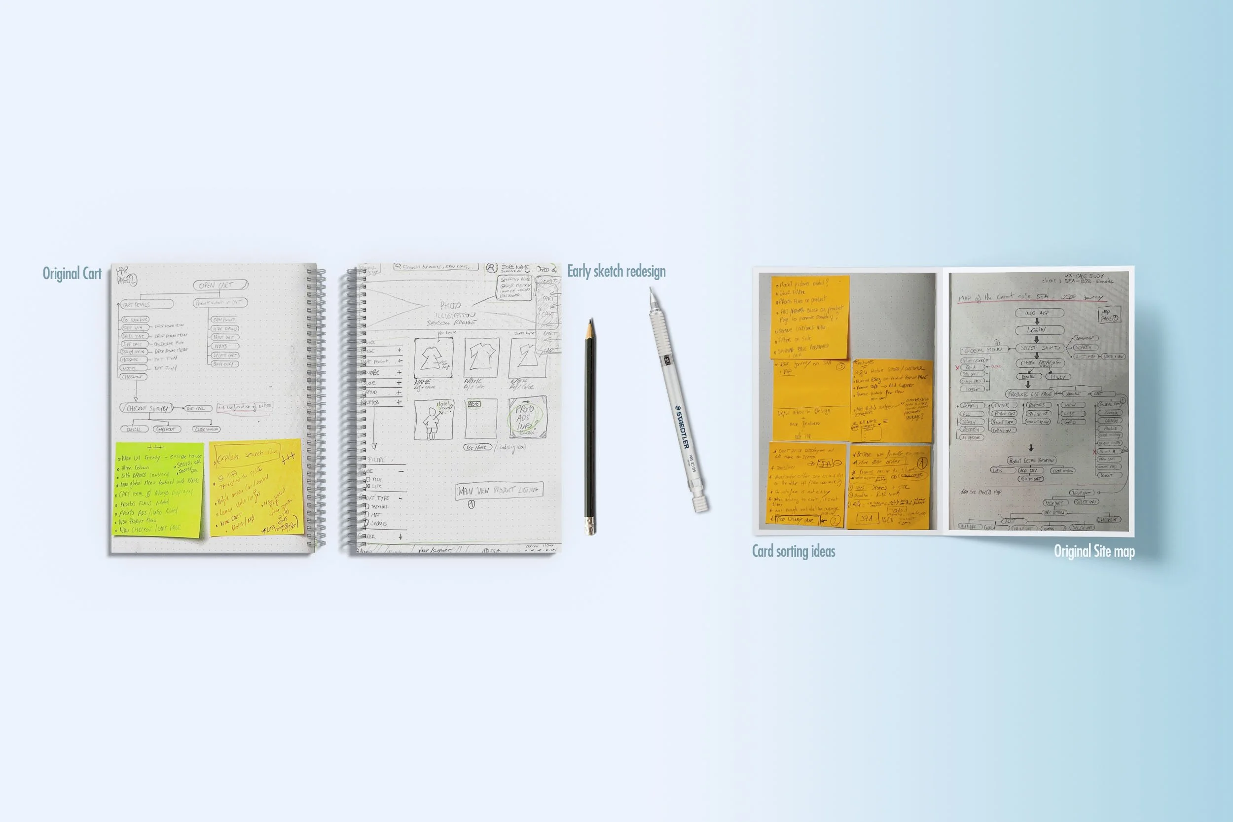
Site Map
5 • Test
Usability tests
Feedback
Outcome
3 • Ideate
Solutions
Suggestions
New User flow map
6 • Conclusion
Outcome
What I learned
Future
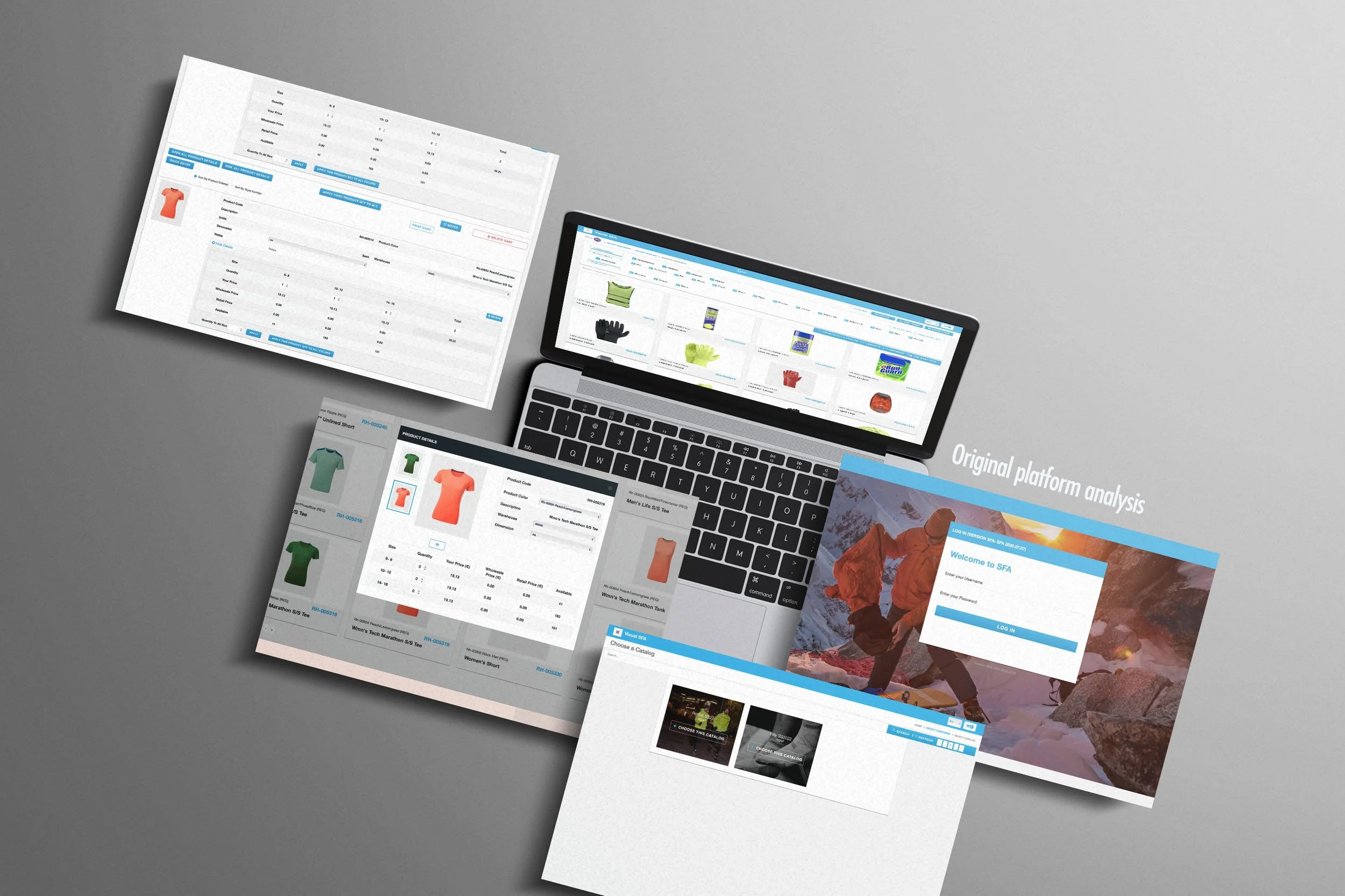
Quick overview of the current software version
As soon as I got hired for the project and when I was granted with a login access, I decided to use the B2B platform as if I was a new retailer, coming here for the first time. I like first impressions, it’s always interesting. It could be experiences or when meeting a person for the first time. (A teacher told me years ago while at University, “you never have a second chance to make a good first impression”. This sticked with me up until today)
The company also gave me their internal statistics of their B2B website, such as visits, country of origin, average orders and turnover.
So I visited the B2B site, made many notes, screenshots, observations. I decided to purchase a couple of products from the physical workbook I was given and went all the way to the very last step, which is usually the button “confirm purchase”.
Needless to say that many issues were already apparent across the platform and I was looking forward to hearing from the users themselves on my next qualitative and quantitative researches.
Qualitative user research
First thing, I decided to perform a qualitative research. This would start to give me an overview on both who the users are and where the issues were hiding.
I was lucky enough to moderate usability testing with 10 retailers who kindly agreed. During the usability testing, participants were given tasks to complete, and I tracked the participants’ progress. I also observed their interactions with the B2B current platform dug deeper into points of interest. I noted any point of frustration, pain points, errors, satisfaction and challenges they expressed.
The pattern became clear very quickly, where I could start to see what were the users motivation to use our platform and what was discouraging them to go through the process or come back using it.
Interviews with current users
The usability testings I moderated were conducted on Zoom.
I started by thanking the user for taking the time of this test and briefly explained who I was and what I was doing.
A couple of general questions were also asked, such as the “age”, “gender”, “position”, “do you consider yourself as tech savvy”, “do you use any B2B website”, “when and where do you use the B2B site”, “how often”, etc.
Then I recorded their screen while I asked them to perform the following task:
You are a retailer, and you need to restock on the following SKU’s ahead of the holidays.
Login to the SFA B2B Ronhill site, look for these SKU’s, add them to your cart, and authorize the asap order.
I asked them to detail out loud everything they were seeing on screen and every step.
What issues are you experiencing now?
Key insights derived from the interviews
Users are mostly male, aged from 30 to 50 and are sales assistant or manager. 80% already use other B2B site to reorder while 15% still prefer to call their sales rep to place an order. (old fashion mostly, but they prefer to do it this way as they enjoy maintaining a relationship with an human - sales rep - and have a chat while!). 5% aren’t really concerned by reordering in season.
25% were not even aware that the Ronhill brand had a B2B site available. (problem of communication on our end?)
The landing page is confusing as the display imagery doesn’t match with their activity (there is an image of a climber in a snowy mountain while our customers here are running stores)
3 users had their password not working.
Site is slow to load.
After login in, the user land on a shipping address selection page, which seems unnecessary as all of them only had one delivery address for their store.
Once the user selected his shipping address, he had to once again choose which catalog range (brands) he would to purchase products from. This is confusing and add too many steps. (While the OSC group owns indeed many brands, our running stores only have access to Ronhill running products, this should be the default choice)
Loading product page seems long to many users.
The product page has a lot informations all over the place! (top bar crowded with name, burger menu, cart, language, then another bar underneath it with filters that take a lot of space, some products references are cut when too long)
Finding a specific product seemed challenging.
The product details page contains a lot of useless empty infos for our users. Only one small photo of the product isn’t a great selling point. The process to add a product to the cart is very confusing with only one “add to cart” button. User has to enter the quantity they need, for various sizes (if required) and hit the “add to cart button”. Once this button is pushed, the user cannot add any extra size/qty in this window. It will have to be later in the cart detail summary.
Too many steps… Once done shopping, the user needs to click on the generic cart button in the top bar, that brings a pop-up window of the cart detail, which isn’t really a cart detail at this stage. The user then needs to click again on this pop-up to “view products in cart”… Which brings finally the user to the cart details (hooray!!!!)
The user can review the cart, edit if required. Again, it will take another 3 clicks to complete the order…
Quantitative research
I did an online survey using Google Forms to gather more informations on the users. A total of 30 people responded which helped me in framing the problems correctly.
Key insights derived from the survey :
Competition analysis
Although a B2B access is usually private, I conducted a competition analysis on the current offering of the other running brands as well as other industries. If the competition get some part right, we should pay attention to these solutions that we may be missing out.
What are they doing better and most importantly how are they doing it better than we do? What’s their strengths and weaknesses? Are they facing the same issues? Any details that could inspire us here?
With the data from the user research, user testings and competitive analysis, it helped me understand where were the biggest issue in the current version our B2B platform. What challenges and frustrations the user experience when visiting our B2B platform (that is, when they do, see the Newsletter solution part below)
Brainstorming
Based on the user interviews, online survey and after listed all issues, we started brainstorming on the important features, redesigns and solution we could address.
I listed priorities from the observations I made during the interview and tests.
I also made sure to keep in mind the stakeholders main objectives all the long this process:
I need to improve the whole user experience of placing an order through the B2B platform.
Improving the user experience would lead to more orders.
More orders would mean an increase of turnover, deeply wished by the stakeholders.
Persona
Thanks to all the data collected from the interviews and survey, I created a persona representing a typical user of the current platform.
The persona helped me arrive at better solutions as it gave an in-depth understanding of the user goals, frustrations and the overall personality.
Solutions
There was a lot of issues to address in order to improve the whole user experience throughout the ordering process.
Imagery and design : more modern and related to running.
Top bar is brand new, simplified, cleaner.
Less clicks from the login page to the confirmation order.
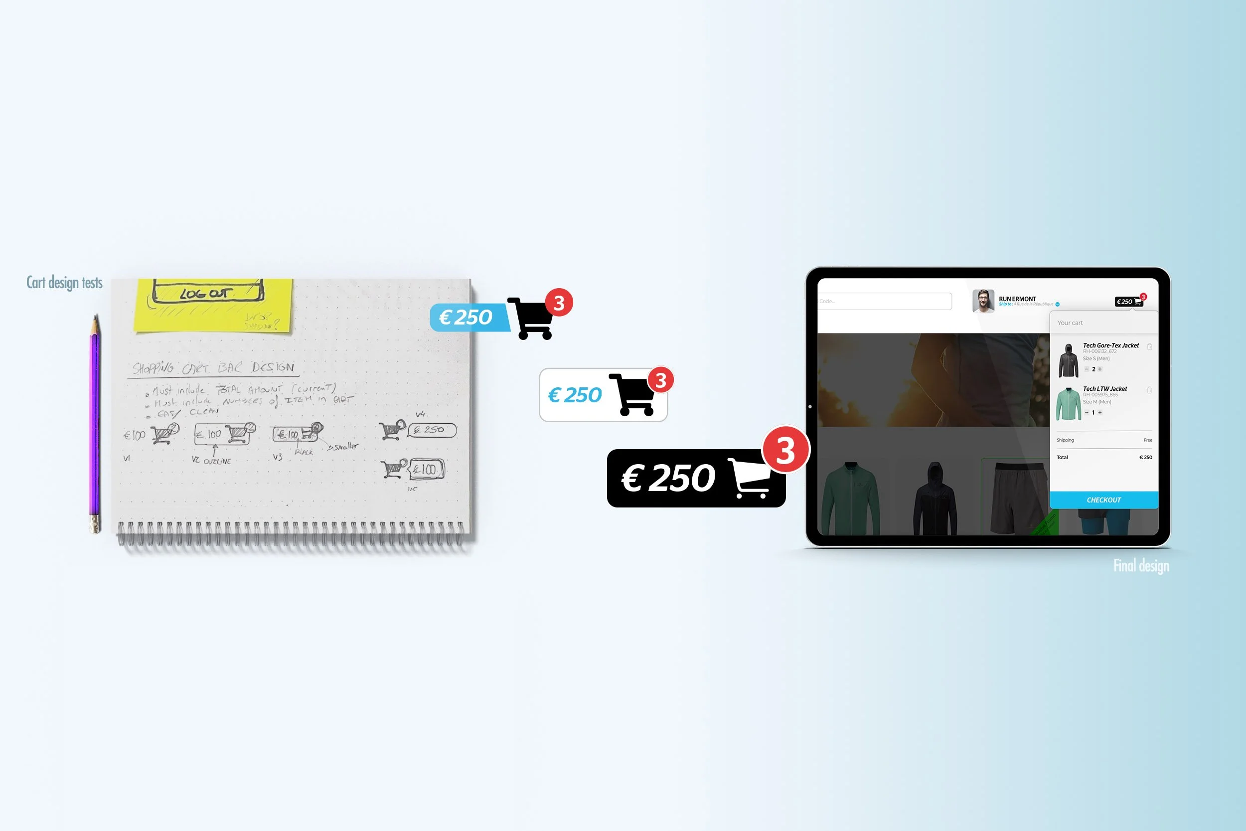
Cart price displayed at all time in the top right corner.
New cart design feature rolling over from the right side of the screen.
Added edit features directly in the cart.
Simplify the interface, better user friendly experience.
Adding quantities/products on the product detail page totally redesigned, with less distracting infos.
Blurred/darker background when the product detail page comes up.
Added picture to the profile brings human touch.
Simplify content of the profile page down to 3 items. (Infos, password, invoice history)
Shipping address is not set by default, no need to select it each time the user logs in.
Catalog of brands is set by default. We already know from our DB which catalog the user should see when login in. This removes an extra step where the user had to select among only one catalog the brand he was shopping for.
Added features for the company to promote deals within the site.
Filters list now on the side, easier and using less space than on top
Unified search now on the top center, making it the first go-to place when the user is looking for something. (inputs can be name of the product, SKU, reference, keyword)
Removed List/Card view option.
Language selection is now on the footer, as well as the social links.
Another interesting insight from the user research was the fact that 50% didn’t even know that Ronhill® had a B2B platform.
What’s the point of having the best B2B platform if our users don’t even know it exists?
That’s why I also suggested the following actions to take for the company ahead of the deployment of the new B2B platform :
Send a newsletter to all retailers/customers to let them know about our B2B platform, the redesign and improvement.
Incentive to drive sales up : special discount for any new order placed on the new site.
Sales reps to talk to their retailers by phone and demonstrate the platform while visiting them.
Online quick training.
Site map & user flow
Design
From early sketches to HD wireframes in XD
First, I sketched my first ideas and Low Fidelity Wireframes on paper. It allowed me to quickly test ideas, features, moved things around. Once I was happy with the look and solutions I brought I moved onto designing these High Fidelity Wireframes using Adobe XD.
The user research, interviews, user testings helped me figuring out quickly the look of the new site : modern, easy to use and new features updated/added.
User journey and flow map were keys in making sure I reduced drastically the number of clicks throughout the whole journey of the order process.
I made many wireframes to lay out content and functionality on the new product page which takes into account user needs and user journey.
Original Login page
Early low definition wireframe
High fidelity wireframe in XD
High fidelity wireframe in XD (error screen)
Design details
Exit the imagery of a snowy mountain, welcome to a running imagery, directly provided by the Ronhill® brand from their in-season photoshoot.
Visual SFA logo is replaced by a Ronhill® I B2B visual identity. This helps the user to be sure is on the correct platform. Visual cues are important.
Some slight transparency on the login item makes it more modern and inline with the current trends. Passwords error will show a red warning version.
Low fidelity wireframe - homepage
High fidelity wireframe in XD
Low fidelity wireframe - cart idea
High fidelity wireframe in XD - cart concept
I was able to quickly move from low fidelity wireframes to high fidelity wireframes in Adobe XD. 1st version.
Universal search bar at the top, profile picture bring some human touch. New product grid with rounded corner and SKU’s infos.
New cart overlay dims screen when opened, directly editable and total amount in the top bar clearly visible.
Style Guide
Usability test
Redesigning a part of the platform, a specific feature or any new work user flow is only good if you test it as early as possible in the design process. Any assumption I made following the results of the user research, interviews, personas, have to be tested.
If the test is successful, then great, I can validate this feature/design and move on to the next. But if it’s not, I go back to the brainstorming phase and change/improve this idea, and test again. This ensures that any new feature or redesign is validated both by our teams and the positive feedback from the user before moving on.
I conducted 4 usability tests on the new version the B2B platform. This was based on my HD wireframes. The developers team were able to mockup a functional version of the platform with the new design. The alpha version of the new site was perfect for my usability tests.
I observed if the same task I initially ask the user to perform during our first interview was easier for them to complete, faster and more enjoyable.
Feedback
The feedback was great, especially coming from some of the same users who previously used the old platform. They were able to compare and quickly gave a positive feedback:
“Look so much better”, “it’s faster and simple”, “oh god, I can finally see the total amount of what I’m spending at all time, perfect for my fixed budgets”, “ordering a product with quantities is now easier”, “I don’t like that picture of me in the profile badge, pick one where I look good ;) “, “Finally"…!”
So the first round of feedback was very promising.
A few comments, interviews helped to further improve the product detail page, by making it even more easy to order. This was typically a great exemple of testing a feature/design, and going back to the drawing board to improve it.
Outcome & conclusion
After weeks of usability tests, working with dev teams, beta versions, the company finally released the new version to their retailers. As suggested before, they also sent a newsletter campaign, explaining the redesigning, letting all their retailers know that Ronhill® had now a good B2B platform for them to use. A launch promotion was also sent as an incentive to come and test/use the new B2B platform.
Sales reps also got in touch with all their retailers to let them know about the B2B platform. They called them or even better, demonstrated the new site while visiting them.
We also offered a quick 15min online training via Zoom for any retailers interested, which proved to be very popular.
6 months laters, the first statistics are coming in and all numbers across the board are up!
More visits, more first time user showing up in the logs and ultimately more orders coming through the platform. It directly means an increase in turnover for the Ronhill® brand, which is exactly what they were hoping for. I also heard from the sales director, that his reps team is also starting to the positive effects, dealing less frequently with order on the phone like before, and freeing up some valuable time for more interesting work.


